Lausanne Marathon Website


Role
UX Design, UI Design, User Research
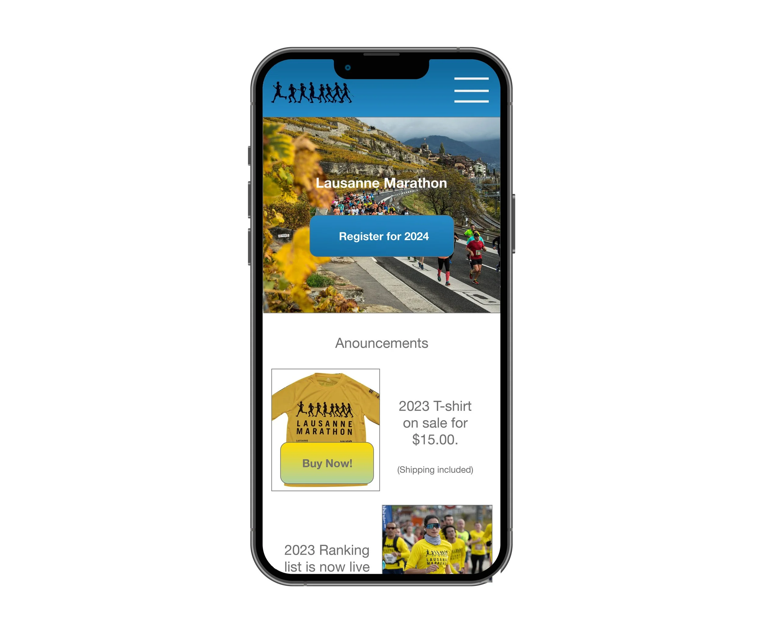
The Lausanne Marathon is the biggest foot race of the region, closing out the race season every last weekend of October. The race draws an international crowd that website communicates to in order for participants to register, buy t-shirts, learn important race day information and more. It not only is an important tool for the runners, but it is also a resource for spectators, and volunteers.
Brief
This was a solo project where I was responsible for executing each phase from analysis to design. I audited the information architecture of the previous site, conducted competitor research, performed user testing and interviews to find pain points to improve, created user personas and journeys, did prototyping, designed the user interface, and tested usability of the website redesign to see where iterations were necessary.
Areas of Focus
Problems
The Lausanne Marathon website faces several challenges. There’s an outdated visual design with an unfamiliar hierarchy on the pages, confusing navigation with an overwhelming amount of options where users are unable to find what they are looking for, inconsistent language translation for every page making it an inaccessible for the international audience, and an untrustworthy credit card checkout system for participants registering. The problematic experience continues off the website to the follow up after registering. Participants do not receive a confirmation e-mail, or details in their inbox before the race making it unclear if you registered correctly.
Goals
Improve Registration Efficiency: Simplify the registration process to reduce user frustration and increase sign-up rates for runners and volunteers.
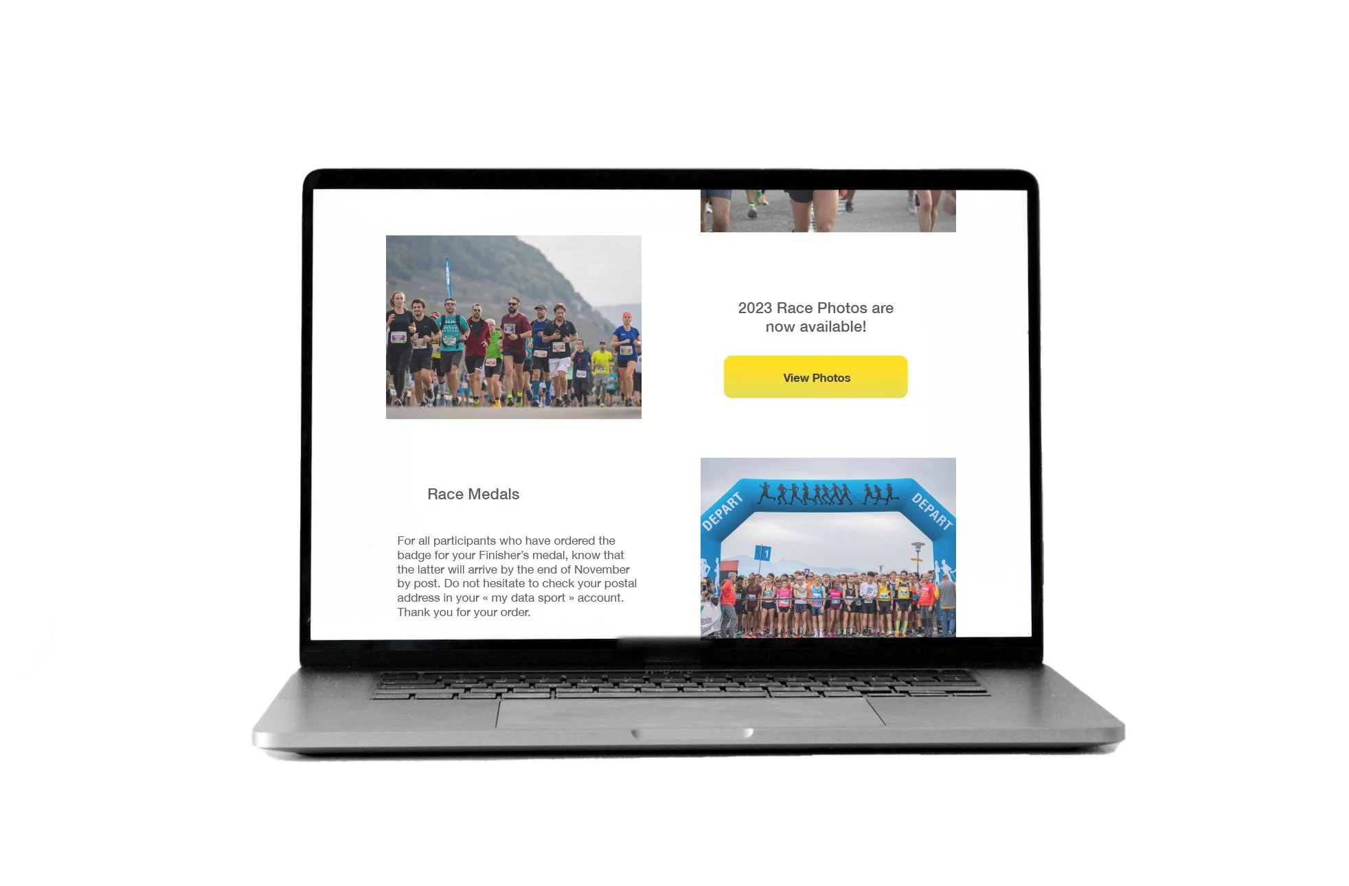
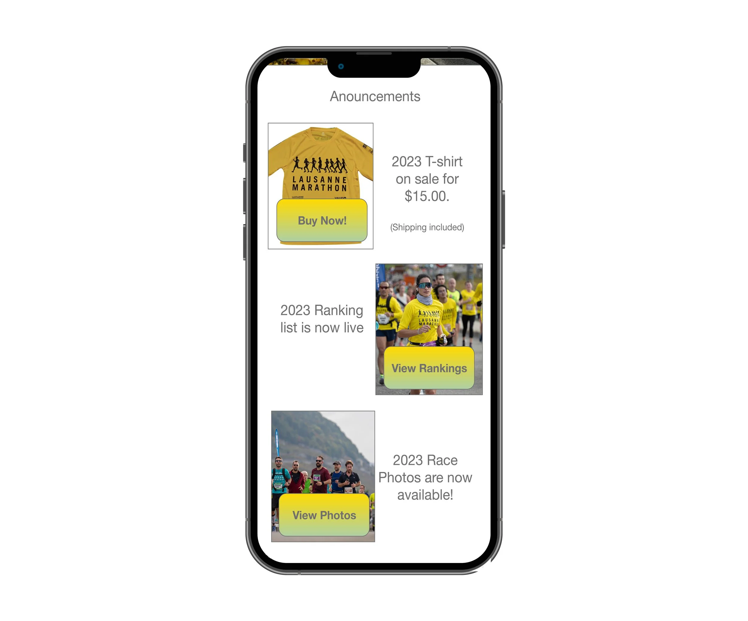
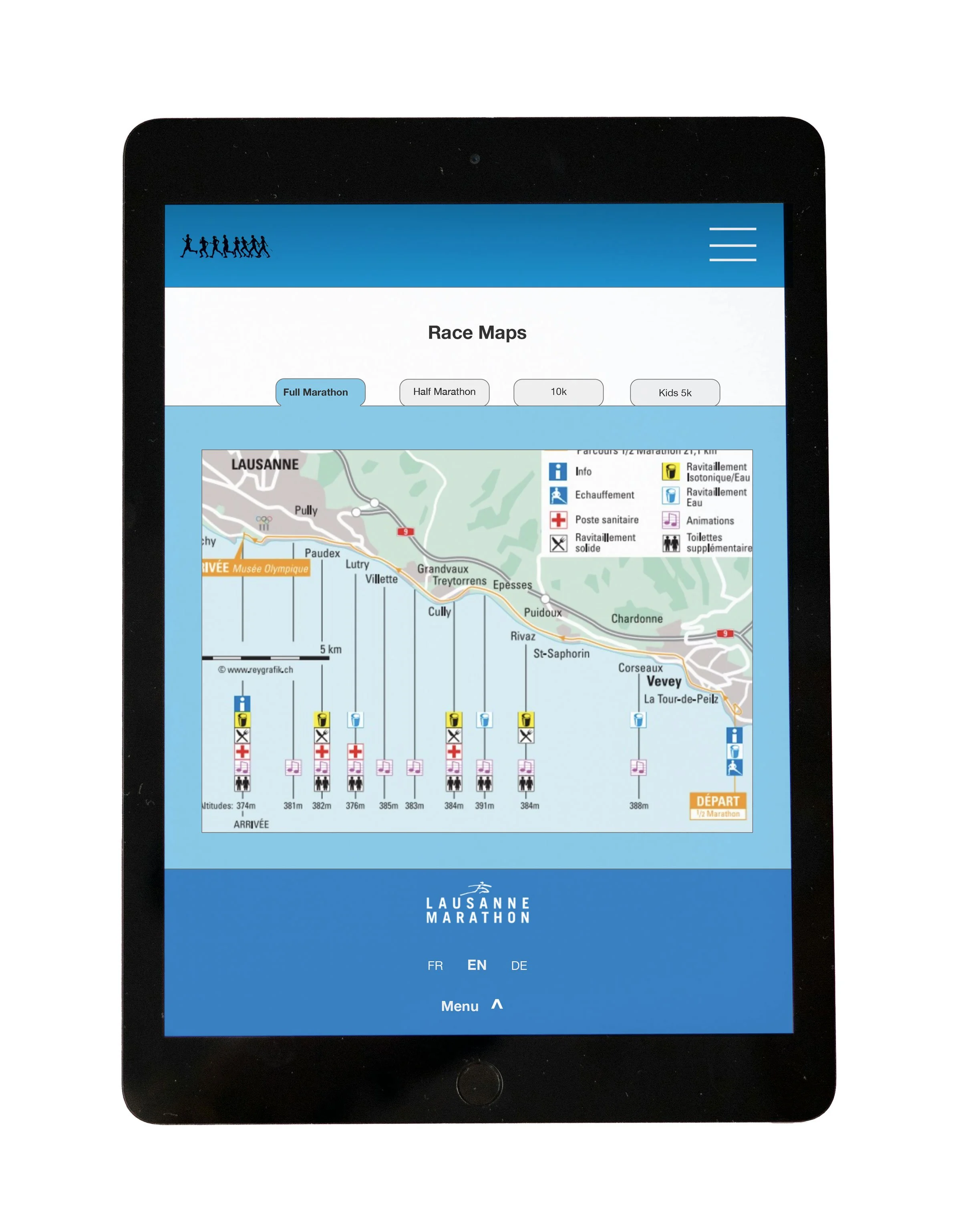
Enhance Event Information Access: Ensure clear, easy access to event details such as route maps, schedules, updates, and FAQs, tailored for different user groups (runners, spectators, volunteers).
Increase User Engagement: Provide a more intuitive platform that encourages user interaction and re-engagement, leading to higher return in participation.
Support Multi-Language Users: Given the international nature of the event, ensure that the platform seamlessly supports multiple languages (French, English, German) and that the pages stay consistent throughout.
Key Takeaways
Registration Time Reduced by 40%: The simplified registration flow allowed users to complete their sign-ups in significantly less time.
Event Information Access: There was a 50% reduction in complaints related to difficulty finding event schedules, route maps, and volunteer instructions. Time spent on looking for specific information was reduced by 30%.
Improved Retention: Many users expressing interest in returning to the site based on smooth registration process and easy access to information.
Higher Accessibility Ratings: The platform received positive feedback from users who rely on language tools due to the careful attention given to accessibility standards in the design.
Outcomes & Impact
Focus on Core User Flows: Improving the registration and information accessibility processes for key user groups (runners, spectators, volunteers) had a significant impact on satisfaction and engagement.
Iterative Design Process is Critical: Constant usability testing and feedback helped refine the design and ensured that it met the needs of users.
Data-Driven Design Decisions: Using analytics and user research to identify pain points helped focus efforts on the most impactful areas of the platform, resulting in tangible improvements.